MONO
NTT docomo /
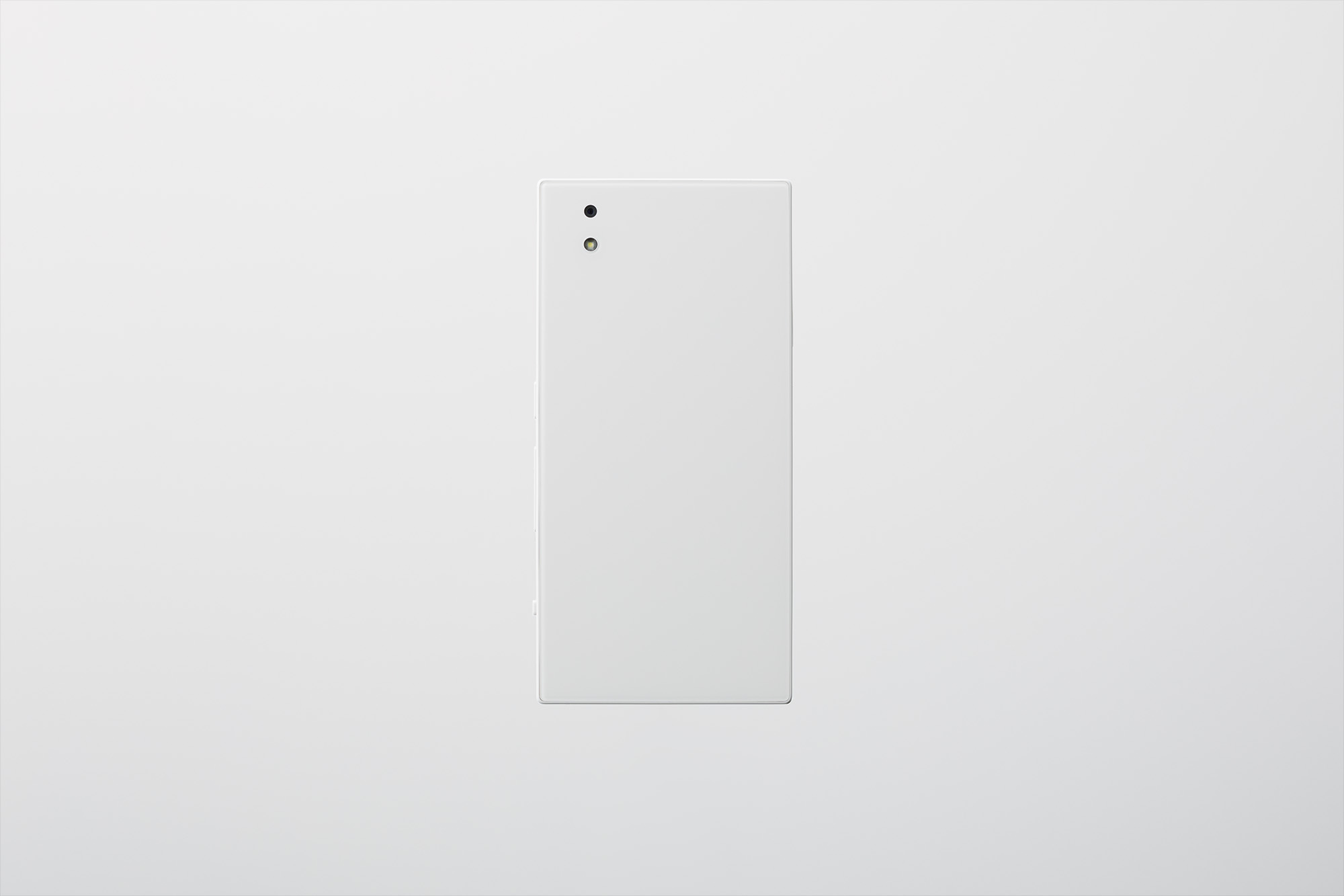
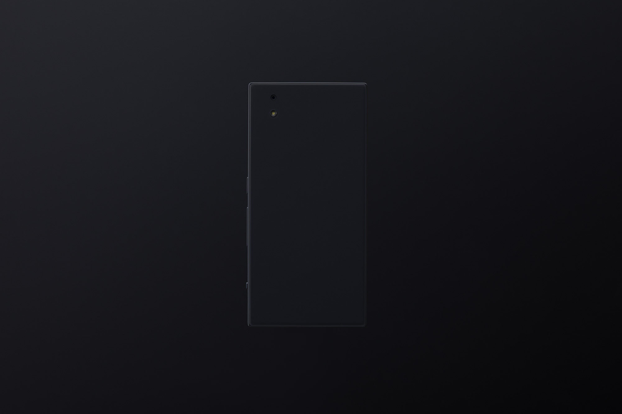
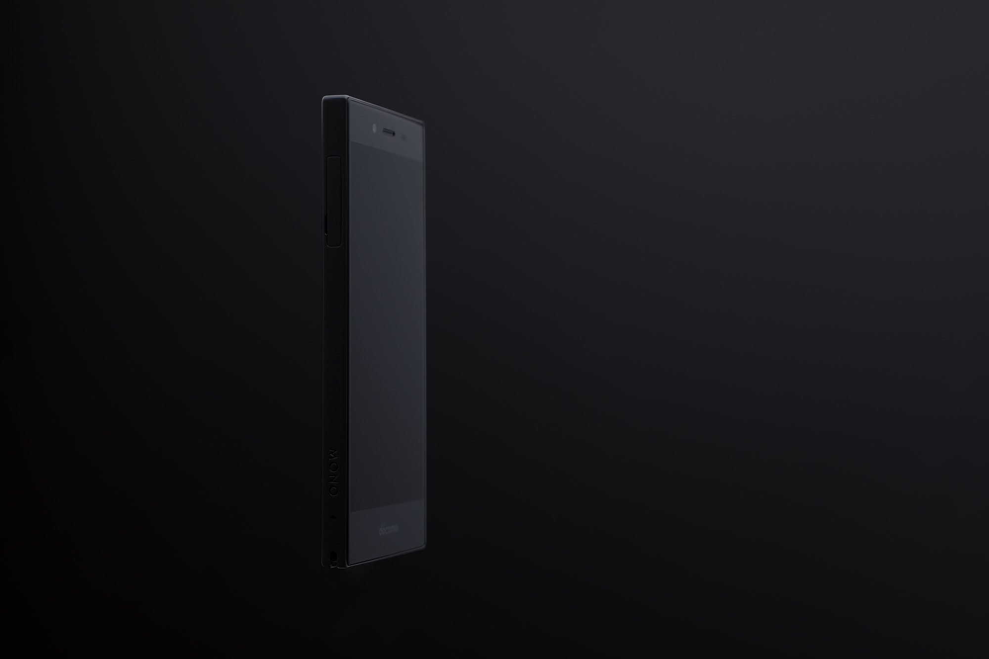
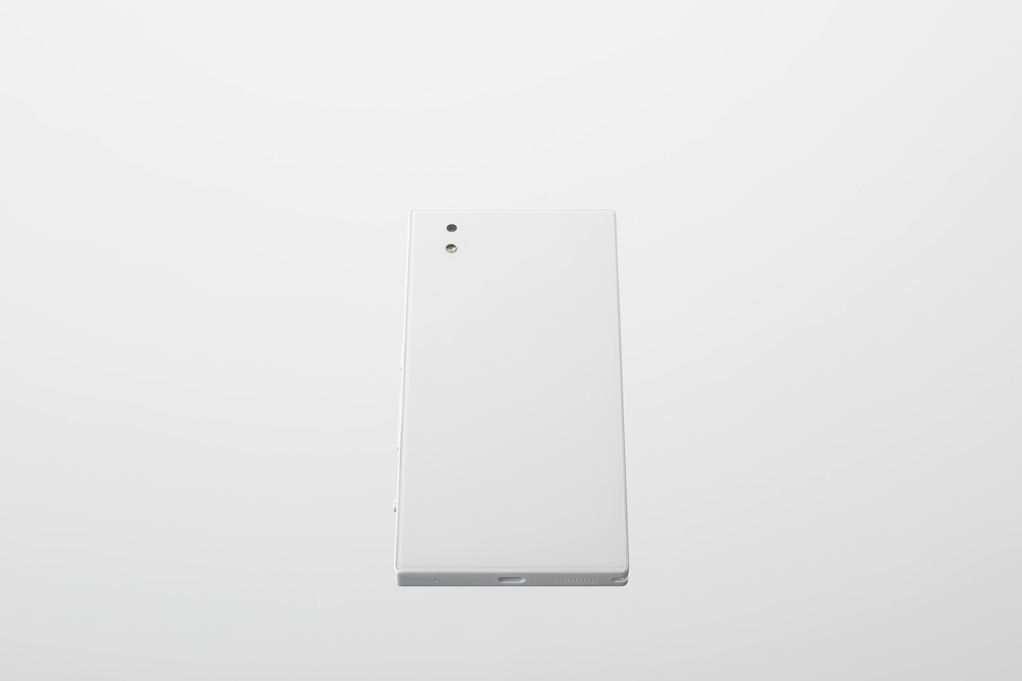
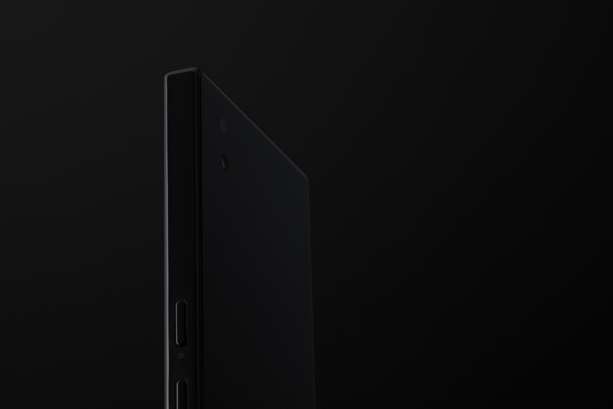
With this, we aimed at something that could be called a standard amongst all of the numerous smartphones around. In order to achieve this, we considered what was optimal in terms of tools that people use, and reexamined each and every aspect. The product was afforded a square form in line with the square screen, with careful consideration given to the proportions so as to achieve an aspect ratio that appeared natural. Rather than a single R, the external R have been attributed free-flowing curves that feel comfortable in the user’s hand. The color is neither jet black nor stark white, neither cool nor warm, but rather a neutral grey. Not locating the logo on the back relieves this product slightly of its electronic equipment aesthesia; when placed face down on a desk, it looks like a type of stationery. Every aspect of this product has been fine-tuned; this standard is one that feels easily accessible to the user.
すでに世の中に多数あるスマートフォンの中で、スタンダードと呼べるような存在を目指しました。 そのために、人が使う道具として何が最適かを考え、ひとつひとつの要素を見直しました。 全体のプロポーションは四角形の画面にあわせるように角のある四角にし、その矩形も縦横比が見た目に自然に、しっくりくる比率を考えて決定されています。 周囲のRは手に心地よく引っかかる形を考え、単一のRではなく自由曲線で構成されています。 カラーは真っ黒でも真っ白でも、クールでもウォームでもない、ニュートラルなグレーです。 背面にロゴを配さないことで電子機器である感覚を少しだけ軽減させ、例えば机にそっと画面を伏せて置いたときに一種の文具かのようにも見えます。 その他にも各所がきめ細かく調律され、より身近に感じられるひとつの道具としてスタンダードが表現されています。
Design : Kazushige Miyake, Daisuke Ishigami
Photo : Goichi Kondo